


I think all 3 of our products, the music video, album cover and website work really well together and is very effective. Throughout all 3 of our products we have kept the same colour scheme of grey/blue/black, font and logo which creates a very strong band identity so audiences can easily recognise the genre and style of band. Also the main theme of our whole project we wanted to get across was the look of the boys as this is what promotes and sells the band to our target audience so throughout all of our products, we have used a lot of imagery and the main focus is on the appearance and style of the band. We wanted them to come across and very fun, outgoing, funny and generally having a good time, but also wanted to have the sexy more serious side of them which I think we’ve achieved and having both sides to them makes it much more effective. We also wanted to promote them as individuals as well as a band so we were conscious of this throughout the project and we’ve made this obvious in our music video and ancillary texts.
Music Video
I think our music video is really effective. As we’ve stuck to all the typical conventions of a pop boy band I think our video would easily appeal to our core target audience of teenage girls and secondary target audiences of older girls and gay men. Our music video looks really professional, modern and stylish and throughout we have focused on the look of the boys. I think we’ve shown the audience the boys are very fun and outgoing through the way they play up to the camera and all look like they’re having a good time together, but we also have the ‘sexy’ close ups and group dance shots which show there is also a serious side as well as a comical side. The comical side of our video became really obvious to me during our screening as everyone found it so funny but thought it looked really professional at the same time so I’m glad this worked. We have stuck to the colour scheme in the video as all of their clothes are grey/blue/black and we also used blue filters on the lights to emphasise it even more. As we wanted to promote them as individuals as well as a band, at the start of the video we have close-ups of each band member introducing the audience to each of them before we see a shot of the band which I think works really well.


Album Cover

On the album cover, again we have shown both sides to the boys. The front cover is a group picture of the band pouting looking very serious and professional whereas on the inside covers we have a collage of loads of small pictures of the boys in the band and group shots which are more comical showing them all having a good time together etc. The album cover is again based completely on imagery, there are pictures of the boys everywhere but this is what promotes the band and sells to the target audience so we used it very well. We have stuck to the colour scheme throughout the album cover as well as they’re all in grey/blue/black clothes and the font we’ve used is grey or black.
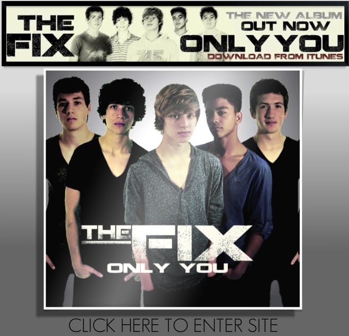
Website

We have an enter page for our website straight away introducing our audience to the band, the genre and what they're about, already marketing them as all you see is the album cover and the advert to download the album.

I feel like we've done as much as we can on our website to sell the band and involve and interact with the audience. On the home page we have a huge picture of the boys with their names targetting our core audience of teenage girls. At the bottom of the page we have individual pictures of the boys with a bit about them - name, age and star sign and a link to each of their individual twitters so the audience feel like they can get to know them individually as well as a band and keep up to date with their favourites. This is very similar to The Wanted's website.


We have used alot of imagery throughout the website and a whole page 'Gallery', again this is to attract our target audience as a lot of the appeal to teenage girls is their look. We have used a lot of comical photos in the gallery as well as professional ones so the audience feel like they can get to know them. Also throughout the webiste we constantly sell the band. We have a advert that links to itunes to download the album, we have links to the band's Facebook and Youtube Channel so they can watch videos and find out more about the band encouring them to spend their money and buy the single. There is also tour dates and links to buy tour tickets and a link to The Fix's official store where fans could buy merchandise. There is also lots of interactivity for the audience, they can sign up and login to The Fix where fans could get constant updates about the band, there is a comment box so fans can tell the band whatever they want making them feel really involved and there is also a competition where fans can email in why they like The Fix and win VIP Tour tickets so there is lots of communication between the band and the fans.

Again we’ve stuck to the same colour scheme and font throughout the website. Our website is very similar to JLS’ and The Wanted, they use a lot of imagery and introduce the audience to them individually as well as a band so this makes our website seem very realistic as real boy bands are very similar.

 I think we marketed the band mainly virally having links to download from iTunes, the online tour tickets and online shop although we also have an advert and an album cover so the album would be sold in shop and is we are a mainstream band, there would be adverts in magazines, newspapers and on tv so there is a lot of cross platform marketing.

We have used alot of imagery throughout the website and a whole page 'Gallery', again this is to attract our target audience as a lot of the appeal to teenage girls is their look. We have used a lot of comical photos in the gallery as well as professional ones so the audience feel like they can get to know them. Also throughout the webiste we constantly sell the band. We have a advert that links to itunes to download the album, we have links to the band's Facebook and Youtube Channel so they can watch videos and find out more about the band encouring them to spend their money and buy the single. There is also tour dates and links to buy tour tickets and a link to The Fix's official store where fans could buy merchandise. There is also lots of interactivity for the audience, they can sign up and login to The Fix where fans could get constant updates about the band, there is a comment box so fans can tell the band whatever they want making them feel really involved and there is also a competition where fans can email in why they like The Fix and win VIP Tour tickets so there is lots of communication between the band and the fans.

Again we’ve stuck to the same colour scheme and font throughout the website. Our website is very similar to JLS’ and The Wanted, they use a lot of imagery and introduce the audience to them individually as well as a band so this makes our website seem very realistic as real boy bands are very similar.


I think we’ve created a very strong and bold band identity and have made it very obvious to the audience what the band are about. I think all 3 of our products look very real and professional and work really effectively together as they help each other market and promote the band ultimately making the record label more money. I’m so pleased with how it all looks.
No comments:
Post a Comment