This blog is now officially closed. I've really enjoyed working with my group on this project and I'm so pleased with all 3 of our tasks! They all look really professional and I can't believe this is my last ever post for my media coursework! :(
Byeeee xxx

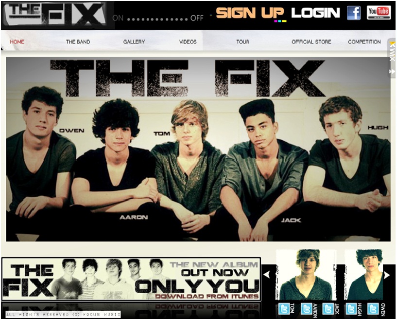
The Fix's Official Site
The Fix Website
The Fix Album Cover
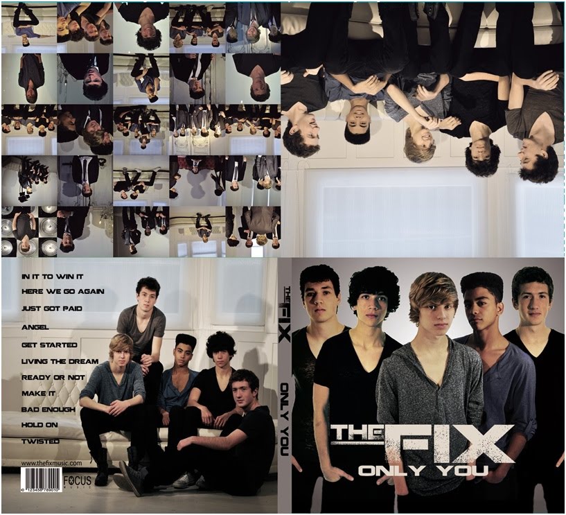
The Fix Album Cover
Tuesday, December 14, 2010
Sunday, December 12, 2010
4. How did you use new media technologies in the construction, research, planning and evaluation stages?
For question 4, we’ve chose to take pictures of all the equipment and technology we’ve used through all the stages of our project: construction, research planning and evaluation, and make a slideshow of it. New media technologies have been extremely important throughout our whole project, especially when filming because of the new HD camera, and it has allowed us to produce and display our project in lots of new and exciting ways.
Camera
Camera
I think the reason our video looks so professional and glossy is because we used a high quality Full 1080p HD camera which is a much better quality than anything else we’ve used before in media where we’ve shot in SD 480p so new technologies were crucial to us in the construction stage of our project. We pretended our video was shot in a 21:9 wide angled lense as this is what real music videos are shot in. The camera actually shoots in 16:9, which is what we’ve shot in previously, but we cropped 13% off the top and bottom by using tape on the top and bottom of the camera’s digital display, to create the illusion we were shooting in 21:9 which I think looks so real and you wouldn’t be able to tell the lenses aren’t actually like that.
Adobe Premiere Pro Editing Software
Adobe Premiere Pro gave us so many amazing opportunities with editing our music video that any other basic editing software wouldn’t be able to and again this was vital in the construction stage of our music video. After capturing our footage, we could cut up shots freely and place them wherever we wanted on however many video tracks we felt necessary to use. As we had so many shots, we had around 11 video tracks, a lot more than we’ve ever used before but this made it look so much clearer to us and we put have put many different shots for the same part of the song on top of each other to see what looked best. We didn’t have to worry about audio tracks as there was no sound on our footage, we just had the track ‘Just Got Paid’ which we cut down from 4.20 to 3.40 when editing on one audio track. Adobe Premiere Pro allowed us to enhance and contrast colours on film and add effects such as reverse which we used on the dance routine which looks really effective. These effects have really added to the professionalism of our video and made it look as good as it could be.
Adobe Premiere Pro gave us so many amazing opportunities with editing our music video that any other basic editing software wouldn’t be able to and again this was vital in the construction stage of our music video. After capturing our footage, we could cut up shots freely and place them wherever we wanted on however many video tracks we felt necessary to use. As we had so many shots, we had around 11 video tracks, a lot more than we’ve ever used before but this made it look so much clearer to us and we put have put many different shots for the same part of the song on top of each other to see what looked best. We didn’t have to worry about audio tracks as there was no sound on our footage, we just had the track ‘Just Got Paid’ which we cut down from 4.20 to 3.40 when editing on one audio track. Adobe Premiere Pro allowed us to enhance and contrast colours on film and add effects such as reverse which we used on the dance routine which looks really effective. These effects have really added to the professionalism of our video and made it look as good as it could be.
Adobe CS3 Photoshop
Adobe CS3 Photoshop has allowed us to edit our photos for the album cover massively. We could brighten, contrast, enhance, sharpen and colour correct all our photos until they were perfect and its made the album cover really stand out looking really glamorous and professional.
Adobe CS3 Photoshop has allowed us to edit our photos for the album cover massively. We could brighten, contrast, enhance, sharpen and colour correct all our photos until they were perfect and its made the album cover really stand out looking really glamorous and professional.
Lighting
Lighting was a huge necessity for the construction of our music video. Lighting really creates the atmosphere and mood of a music video so we knew how important it was and we wanted the lighting to really stand out in the video. We were lucky enough to be able to use the studio in our school which is full of new media technologies and has floor lights and lights all around the studio. We put blue filters on some of the lights to match our colour scheme of ‘The Fix’ and together with the use of the haze machine and all the lighting I think our lighting is really effective in the video and does really stand out, a lot of people who have watched the video have picked up and commented on the lighting so it obviously is a key feature of the video. On location in the house we used a three-point studio lighting set which was extremely helpful in lighting the shots in the house although the studio lights are what makes the video.
Lighting was a huge necessity for the construction of our music video. Lighting really creates the atmosphere and mood of a music video so we knew how important it was and we wanted the lighting to really stand out in the video. We were lucky enough to be able to use the studio in our school which is full of new media technologies and has floor lights and lights all around the studio. We put blue filters on some of the lights to match our colour scheme of ‘The Fix’ and together with the use of the haze machine and all the lighting I think our lighting is really effective in the video and does really stand out, a lot of people who have watched the video have picked up and commented on the lighting so it obviously is a key feature of the video. On location in the house we used a three-point studio lighting set which was extremely helpful in lighting the shots in the house although the studio lights are what makes the video.
The Internet
The internet was crucial to our project in every stage apart from the construction so research, planning and evalution. Blogger, Wix, Youtube and Facebook have been the 4 main websites used in our project. Blogger has been our platform to display all our work and communicate with each other. Youtube was extremely important when researching as it allowed us to watch videos and take references from them helping with things like the dance routine. Youtube also allows us to show our music video which is the most important thing! Along with Facebook it lets us reach a wide audience and gives a platform to young people which is easy, free and accessible to watch our music video. Youtube is obviously a big success as our video has over 1,300 views only a week after we first put it up! Facebook allowed us to create an event page for our screening and invite all our friends to come so this was a huge factor in why our screening was such a big success. Both of them allow us the opportunity to receive audience feedback which is important for our project. Also Wix was really important in the construction stage of our project as it allowed to create out website which is obviously a huge part of the whole project! Wix was really quick and easy to pick up as it was flash based and allowed us to upload pictures, links, videos etc. and made our website look very professional.
3. What have you learnt from your audience feedback?
We filmed our screening so we would have their reactions on film and we wanted to get some audience feedback on camera as well as on the questionnaires. Our screening was a huge success, we had a massive turnout of about 70-80 people, the room was packed and everyone seemed to love our music video! At the end of the screening video we go through and discuss some of the questionnaires.
At the screening we had printed our about 30 questionnaires for people to fill in so not everyone could fill one in but here are a few examples of some of them:


I think we had a good variety of people at our screening as we had boys and girls and people from different years so a slight variety in age from around 15 – 18. However we didn’t get any feedback from younger girls who were our secondary target audience or adults (especially gay men as they were also our target audience) which would have been interesting to hear.
Here are some of the general themes from our questionnaires:
Themes
• Teenage girls
• Screaming girls
• Boy bands
• Fun
• Funny
• Money
• Teenage girls
• Screaming girls
• Boy bands
• Fun
• Funny
• Money
Best bits
• Lighting
• Comical side to it
• Individual shots/close-ups
• Performances
• Atmosphere/mood of the song
• Hugh’s ‘money money money’ part
• Lighting
• Comical side to it
• Individual shots/close-ups
• Performances
• Atmosphere/mood of the song
• Hugh’s ‘money money money’ part
Other bands/style ours was similar to?
• JLS
• The Wanted
• JLS
• The Wanted
Music channel you’d see this on?
• MTV
• Smash Hits
• Viva
• MTV
• Smash Hits
• Viva
Was it professional?
• Everyone that filled out a questionnaire said it was professional
• Everyone that filled out a questionnaire said it was professional
Average rating
• Everyone said 9/10 out of 10
• Everyone said 9/10 out of 10
I’m really pleased with our feedback because a lot of the themes people mentioned, we had talked about as a group and we wanted to get them across in the video eg. the money theme by using the rich house and the suits and I think we showed this really well. Also a lot of people mentioned JLS and The Wanted and we had obviously based the look and style of the band and video on these two bands so we were really happy about that. One shot we got a lot of reaction to was the lighting shot at the beginning where each one comes on to the beat of the music introducing the audience to the band for the first time. We worked really hard on this shot and we wanted it to look really effective as it is our opening shot so it’s the thing that first pulls in the audience so we’re glad people picked up on how effective it was.

The only negative we seemed to get was that Tom Owen didn’t get enough screen time in the video although a lot of people said nothing needed to be improved. I agree that maybe we could have evened up the screen time for each band member but he wasn’t as confident in front of the camera and wasn’t as good at lip-syncing or dancing as the other boys so we decided not to include him as much.
We also asked people for feedback on our website and album cover which again was generally really good:
Website
• Thought it looked very professional and realistic
• Liked all the shots and general photos around the website, really good photography• Liked the individual twitters and bit about each band member
• Liked all the interactivity and communication
• Tour dates and online shop pages looked very realistic and liked the links to ticketmaster and amazon
• We could have improved the merchandise page, maybe photoshopped ‘The Fix’ onto a plain T-Shirt and hoodie
• Everyone thought they had the boy band ‘look’ which is really important
Album cover
• Front cover really striking, stands out, looks really professional similar to JLS and The Wanted. Simple but effective.
• Liked the collage of all the shots put together, works really well• Liked the style/colour scheme of the whole album
• Everyone thought they had the boy band ‘look’ which is really important

Overall I’m really pleased with all our audience feedback and it has confirmed to us to we have achieved everything we wanted to with style, genre, comical value etc. and especially we were happy to hear that everyone thought it looked very realistic and professional which was a big aim of ours. I think all 3 of our products work really well together to target the audience and I’m so happy with how effective it all is.
Saturday, December 11, 2010
2. How effective is the combination of your main product and ancillary texts?
I think all 3 of our products, the music video, album cover and website work really well together and is very effective. Throughout all 3 of our products we have kept the same colour scheme of grey/blue/black, font and logo which creates a very strong band identity so audiences can easily recognise the genre and style of band. Also the main theme of our whole project we wanted to get across was the look of the boys as this is what promotes and sells the band to our target audience so throughout all of our products, we have used a lot of imagery and the main focus is on the appearance and style of the band. We wanted them to come across and very fun, outgoing, funny and generally having a good time, but also wanted to have the sexy more serious side of them which I think we’ve achieved and having both sides to them makes it much more effective. We also wanted to promote them as individuals as well as a band so we were conscious of this throughout the project and we’ve made this obvious in our music video and ancillary texts.
Music Video
I think our music video is really effective. As we’ve stuck to all the typical conventions of a pop boy band I think our video would easily appeal to our core target audience of teenage girls and secondary target audiences of older girls and gay men. Our music video looks really professional, modern and stylish and throughout we have focused on the look of the boys. I think we’ve shown the audience the boys are very fun and outgoing through the way they play up to the camera and all look like they’re having a good time together, but we also have the ‘sexy’ close ups and group dance shots which show there is also a serious side as well as a comical side. The comical side of our video became really obvious to me during our screening as everyone found it so funny but thought it looked really professional at the same time so I’m glad this worked. We have stuck to the colour scheme in the video as all of their clothes are grey/blue/black and we also used blue filters on the lights to emphasise it even more. As we wanted to promote them as individuals as well as a band, at the start of the video we have close-ups of each band member introducing the audience to each of them before we see a shot of the band which I think works really well.


Album Cover

On the album cover, again we have shown both sides to the boys. The front cover is a group picture of the band pouting looking very serious and professional whereas on the inside covers we have a collage of loads of small pictures of the boys in the band and group shots which are more comical showing them all having a good time together etc. The album cover is again based completely on imagery, there are pictures of the boys everywhere but this is what promotes the band and sells to the target audience so we used it very well. We have stuck to the colour scheme throughout the album cover as well as they’re all in grey/blue/black clothes and the font we’ve used is grey or black.
Website

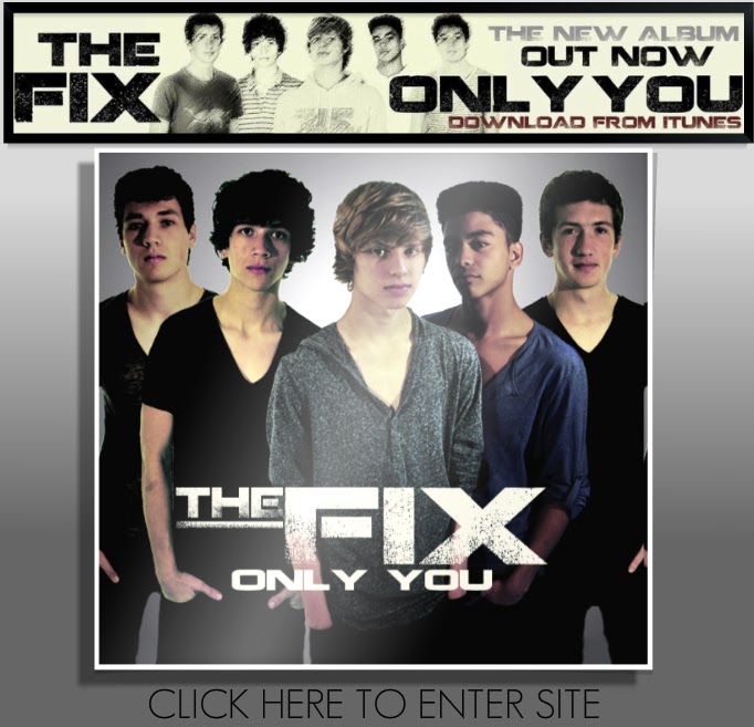
We have an enter page for our website straight away introducing our audience to the band, the genre and what they're about, already marketing them as all you see is the album cover and the advert to download the album.

I feel like we've done as much as we can on our website to sell the band and involve and interact with the audience. On the home page we have a huge picture of the boys with their names targetting our core audience of teenage girls. At the bottom of the page we have individual pictures of the boys with a bit about them - name, age and star sign and a link to each of their individual twitters so the audience feel like they can get to know them individually as well as a band and keep up to date with their favourites. This is very similar to The Wanted's website.


We have used alot of imagery throughout the website and a whole page 'Gallery', again this is to attract our target audience as a lot of the appeal to teenage girls is their look. We have used a lot of comical photos in the gallery as well as professional ones so the audience feel like they can get to know them. Also throughout the webiste we constantly sell the band. We have a advert that links to itunes to download the album, we have links to the band's Facebook and Youtube Channel so they can watch videos and find out more about the band encouring them to spend their money and buy the single. There is also tour dates and links to buy tour tickets and a link to The Fix's official store where fans could buy merchandise. There is also lots of interactivity for the audience, they can sign up and login to The Fix where fans could get constant updates about the band, there is a comment box so fans can tell the band whatever they want making them feel really involved and there is also a competition where fans can email in why they like The Fix and win VIP Tour tickets so there is lots of communication between the band and the fans.

Again we’ve stuck to the same colour scheme and font throughout the website. Our website is very similar to JLS’ and The Wanted, they use a lot of imagery and introduce the audience to them individually as well as a band so this makes our website seem very realistic as real boy bands are very similar.

 I think we marketed the band mainly virally having links to download from iTunes, the online tour tickets and online shop although we also have an advert and an album cover so the album would be sold in shop and is we are a mainstream band, there would be adverts in magazines, newspapers and on tv so there is a lot of cross platform marketing.

We have used alot of imagery throughout the website and a whole page 'Gallery', again this is to attract our target audience as a lot of the appeal to teenage girls is their look. We have used a lot of comical photos in the gallery as well as professional ones so the audience feel like they can get to know them. Also throughout the webiste we constantly sell the band. We have a advert that links to itunes to download the album, we have links to the band's Facebook and Youtube Channel so they can watch videos and find out more about the band encouring them to spend their money and buy the single. There is also tour dates and links to buy tour tickets and a link to The Fix's official store where fans could buy merchandise. There is also lots of interactivity for the audience, they can sign up and login to The Fix where fans could get constant updates about the band, there is a comment box so fans can tell the band whatever they want making them feel really involved and there is also a competition where fans can email in why they like The Fix and win VIP Tour tickets so there is lots of communication between the band and the fans.

Again we’ve stuck to the same colour scheme and font throughout the website. Our website is very similar to JLS’ and The Wanted, they use a lot of imagery and introduce the audience to them individually as well as a band so this makes our website seem very realistic as real boy bands are very similar.


I think we’ve created a very strong and bold band identity and have made it very obvious to the audience what the band are about. I think all 3 of our products look very real and professional and work really effectively together as they help each other market and promote the band ultimately making the record label more money. I’m so pleased with how it all looks.
1. In what ways does your media product use, develop or challenge forms and conventions of real media products?
To answer this question we did a video response in which we talk about how our product applies to Goodwin's theory and Vernallis' theory and how we've stuck to the conventions of music videos in general as well as pop boy band videos. We then go on to discuss how our two ancillary products, the website and album cover also follow conventions of the music industry.
We purposely followed all the typical conventions of a pop boy band in our music videoas we wanted it to seem as realistic and mainstream as possible and I think we’ve shown this really well.
We purposely followed all the typical conventions of a pop boy band in our music videoas we wanted it to seem as realistic and mainstream as possible and I think we’ve shown this really well.
Videos we have taken references from are JLS and The Wanted
Typical conventions of a pop boy band are:
Fun upbeat light-hearted style
I think we created this atmosphere very well in our music video. The song is very lively and we’ve got a very fast pace throughout the video, our shots never really last more than 2 seconds and we’ve got a lot of quick cuts to the music emphasising the fast up beat pace of the video. The boys all look like they’re having a good time, laughing and playing around to the camera etc. This is very similar to videos from JLS and the Wanted
Hardly any narrative – just performance
We’ve stuck to this convention completely as we have no narrative at all in our video, the only concept we have in our video is the boys getting ready at the start to go out on a Friday night but apart from that it is completely performance based.
Set dance routines
Again we’ve followed this convention as we have one dance routine we use throughout the video which we cut back to a lot and use it as our master shot of the band. This is very similar to JLS’ video One Shot and Beat Again.


Colour scheme for costume
We used a grey/blue/black colour scheme for out costume in the video, in the studio we made it very stylish and fashionable eg. tight v-necks, lace up boots etc. and in the house we had them in suits in the rich location so this connotes the money theme of the song. We also used the same colour scheme throughout our album cover and website which creates a really strong band indentity.


The ‘look’ – lots of close up and looking into the camera
This is probably the most important convention of a boy band so we were very conscious of making sure we had close ups and ‘the look’ when we were filming and throughout editing the music video. Looking into the camera makes the audience feel very involved and entices them to watch more, it also attracts our core target audience of teenage girls as a lot of the appeal to them is about their look so they’ll want to see a lot of close ups.


Other conventions of music videos in general are:
The relationship between lyrics and visuals
We represented a lot of the lyrics in the music video visually, this is important as it emphasises the lyrics of the song and makes it really clear to the audience what the video is about.

"In the mirror"

"Just got paid"

"Nodding your head"
The relationship between music and visuals
Throughout our music video we constantly cut to the beat of the music so we have a lot of quick sharp cuts as the music is very upbeat. This emphasises the beat of the music and makes it flow very easily and makes it very easy for audiences to watch. It also makes the editing really stand out and makes the video look very professional.
Thursday, December 2, 2010
Album Cover
The album cover is all done!! It's been sent off to the printers to be made into a digipack so we're just waiting to get that back now..
Front Cover

Whole Cover


Screening
We had our screening yesterday and it went so well!! We'd make a facebook event page and invtied everyone in our year and some from the years below and we had a huge turnout because of this! The room was completely full, we'd laid out tables for people to sit but everyone was standing aswell because was the room was so packed. We printed 30 questionnaires but as we had alot more people than that, not everyone could fill out a questionnaire. The response generally was very positive, most people giving the video 9 or 10 out of 10. Alot of people said it looked really professional and the themes of boy band, screaming girls, money etc. came up a lot. Also a lot of people compared them to JLS and The Wanted which is the look/style we were going for so we were glad this was recognised. We filmed the screening so we'll put that up on Youtube soon!

Subscribe to:
Posts (Atom)